Double chevron up icon
New in 1.1.0A single SVG path on a 24×24 grid, drawn at the same optical weight as the other 3,872 icons in the ThreeJS Assets Icons library — so it sits in a toolbar next to any of them without re-balancing. Filled with currentColor, which means colour and size come from your CSS rather than from a second export.
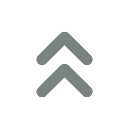
Using the double chevron up icon
Three ways to get it on screen. Nothing here needs an icon font, a build step, or a runtime dependency.
The path data below is a placeholder. The real geometry ships when you have access to this icon — the snippets themselves are exactly what you will paste.
Inline SVG
Paste it straight into your markup. No runtime, no font, no request — the icon ships as part of the document.
<svg xmlns="http://www.w3.org/2000/svg" width="24" height="24" viewBox="0 0 24 24" fill="currentColor"><path d="…" /></svg>React / TypeScript component
The same path as a typed component. Spreading SVGProps means className, onClick, and aria-* all pass through untouched.
export function DoubleChevronUpIcon(props: React.SVGProps<SVGSVGElement>) {
  return (
    <svg xmlns="http://www.w3.org/2000/svg" width="24" height="24" viewBox="0 0 24 24" fill="currentColor" {...props}>
      <path d="…" />
    </svg>
  );
}
Sizing and recolouring
Every icon is drawn with fill="currentColor" on a 24×24 grid, so it inherits colour from the surrounding text and scales with width/height alone — no second export per theme.
// Colour follows the text colour, size follows the props.
<span className="text-emerald-600">
  <DoubleChevronUpIcon width={32} height={32} />
</span>

// Or drive both from CSS:
// .toolbar svg { width: 1.25rem; height: 1.25rem; color: #12A150; }
Related arrows & navigation icons
Nearest by tag, from the same 48-icon set.
 Arrow up
 Double chevron down
 Double chevron left
 Double chevron right
 Arrow swap vertical
 Arrow to top
 Arrow bounce
 Arrow curve down
 Arrow curve up
 Arrow down
 Arrow down left
 Arrow down right